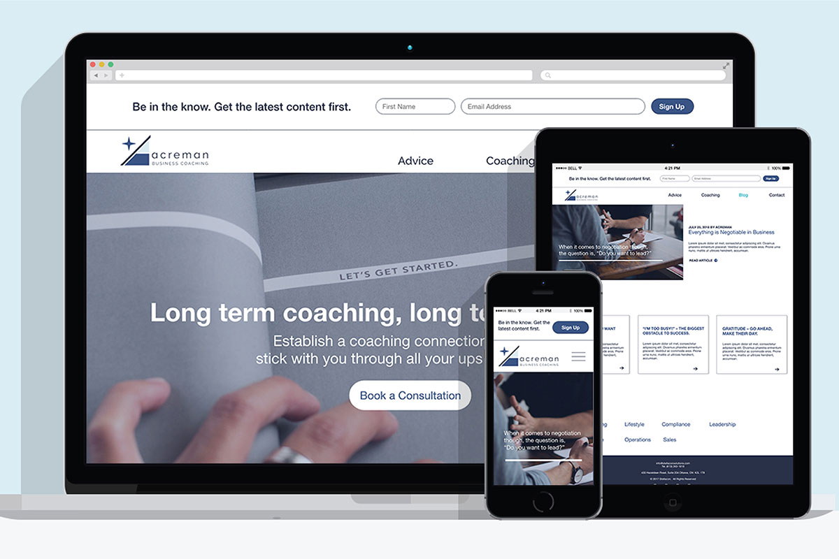
Leading a team with the goal of adapting a business' brand to reflect more of the man who runs it all. We took the company image from ambiguous and shot it over the mountain and into the stars.
Challenge
This was a learning experience moved along by our professors. Our team was paired up with a client whose company image needed to be more unified and distinct to have a shot at piercing into the online market further down the road. Specializing in business coaching, the company needed to maintain a professional and experienced look.
Insight
The company's original name was "Stellacon Business Solutions" which did not speak to the business side, nor the human side of business coaching. We all agreed it sounded like something in the tech field. We did like the etymology of the name: a mix up of the word constellations, making connections between stars.
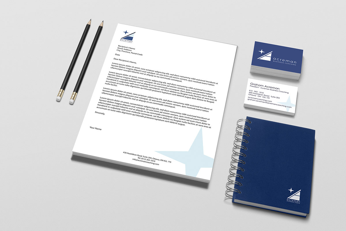
Solution
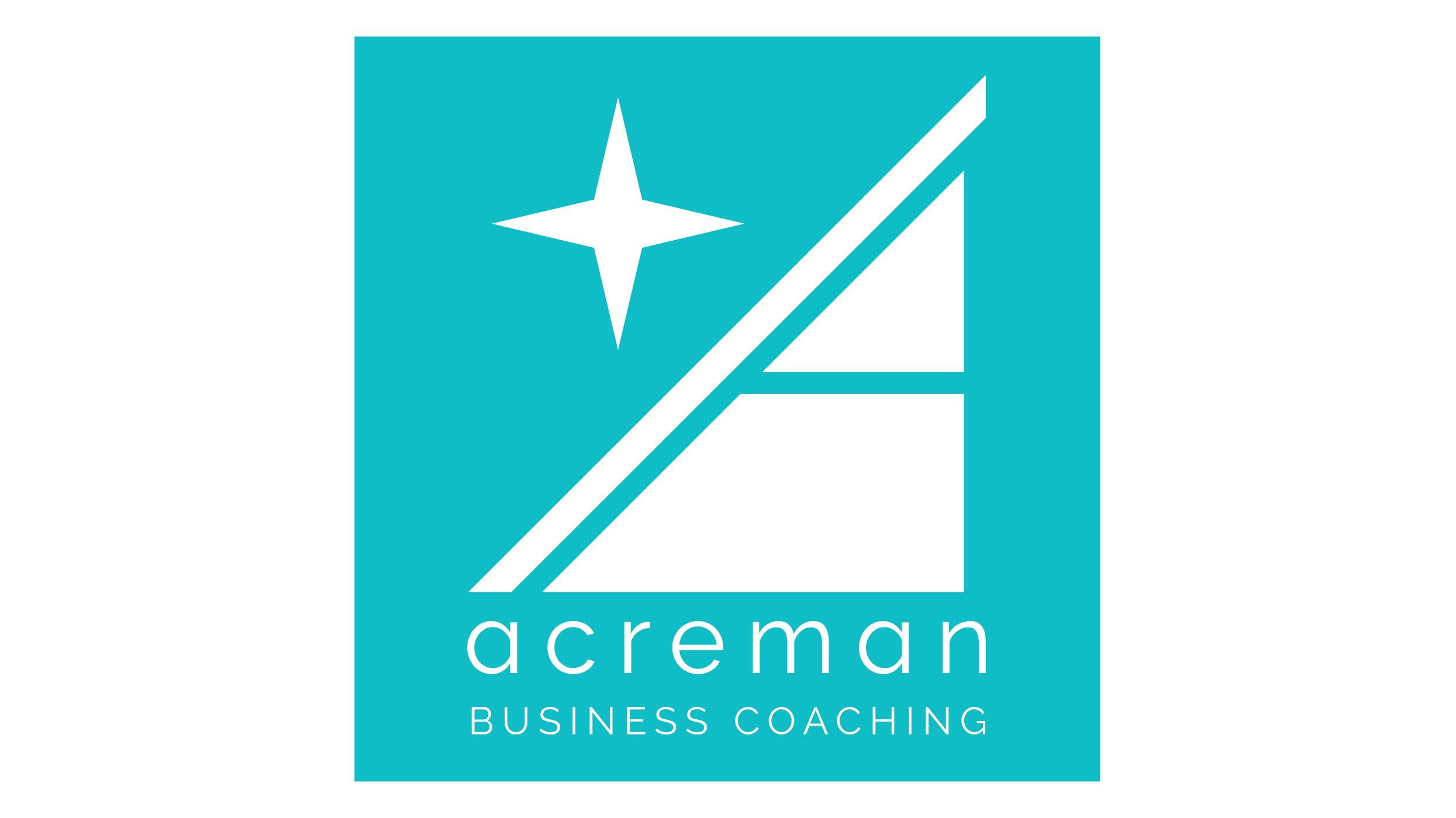
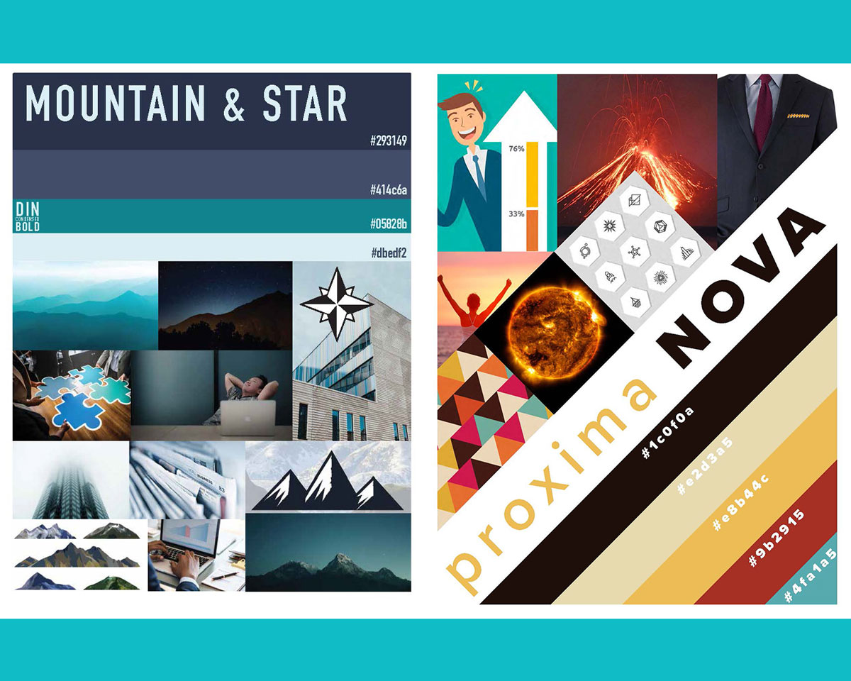
Since our client is all about making businesses get better results, we opted to base our concepts on upward trends and overcoming obstacles. The two main divides being natural and cool versus abstract and warm. Since we loved the star so much we included it prominently as well; Our client is the guiding star. In the end, the client decided to criss-cross the pitches, which we adapted into the abstract and cool final product.
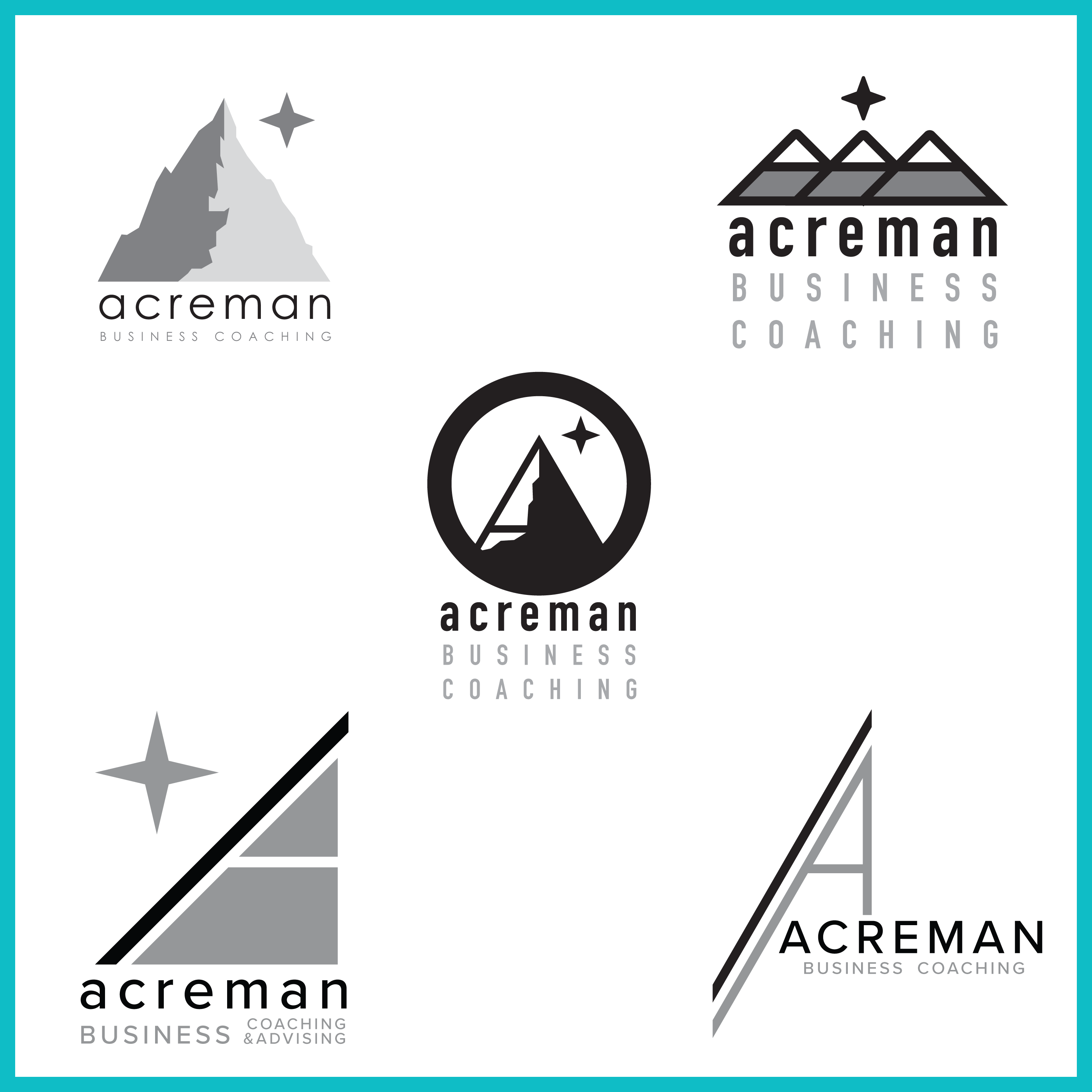
Before
After
Logo Animation
A little experiment on how the logo could possibly look with a little animated intro.